DirectCasting

A mobile app that connects professionals with talent effortlessly, without the need to pay a 20% fee or sign with a talent agency.

role icon

Role

UX researcher
UX/UI designer

platform icon

Platform

IOS App

sector Icon

Sector

Entertainment
Film industry

screens icon

Screens

21 total
start to end

tools icon

4 Tools

Sketch,
Photoshop,
AE, Balsamiq

Calender Icon

Duration

35 days
to complete

My first project
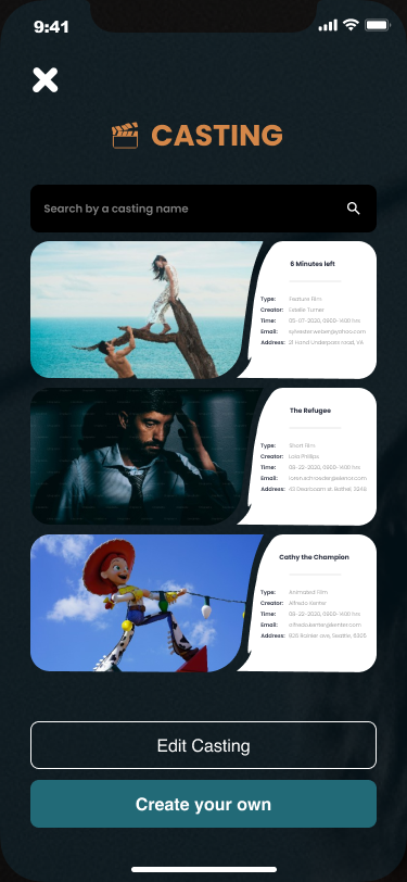
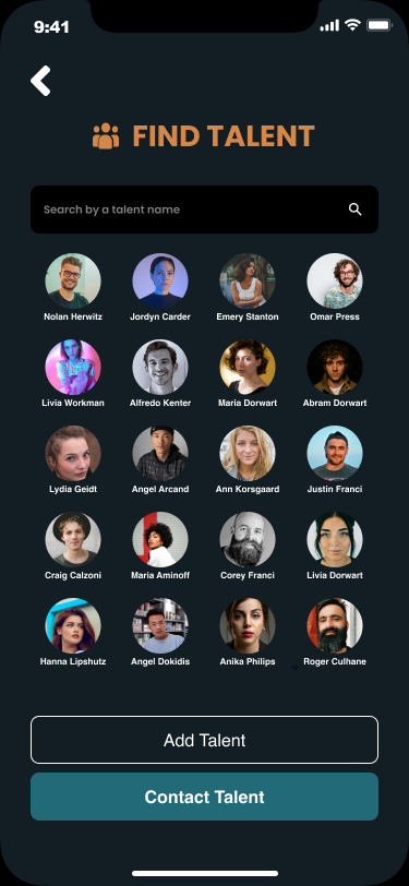
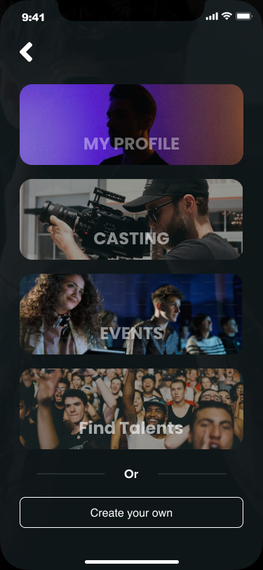
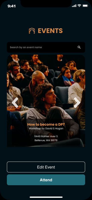
 screen 1  screen 3  screen 4  screen 2

My Impact


  • Optimized the conversion funnel, leading to a 15% increase in the percentage of users completing key actions, such as signing up for an account or purchasing premium features.

  • Observed a 25% increase in average session duration, a 20% rise in the number of sessions per user, and a 30% increase in screen views per session.

My Impact


  • Implementation of retention strategies led to a 20% increase in the app's 30-day retention rate and a 10% increase in the 90-day retention rate. This means that a higher percentage of users are returning to the app.

  • 40% reduction in load times, a 50% decrease in app crashes, and a 25% improvement in latency issues. This resulted in higher user satisfaction, reflected in a 15% increase in app ratings.

Section 01

Overview


Seattle is an inspiring city for the film industry. As a Seattleite filmmaker myself, working with reputable clients like Microsoft, I've observed a few ongoing challenges that hinder artists from chasing their goals.

Film image
Problem

Familiar Problem


1) There is no efficient way for film community members to meet and collaborate without intermediation. Talent agencies cost actors 20% of their paycheck, which considerably affects their income.

2) A cumbersome process facing talent in uploading their self-taped auditions and sending them to potential clients, which causes frustration.

I have yet to come across a digital solution for connecting filmmakers, talent, and cast members seamlessly and without limitations.
For those reasons, I've presented new solutions with this app.
audition pic
Goal

3 Goals Of The App


1) Reach 3 types of users, not just a single type like competitive apps (actors, clients, and crew members).

2) A direct, easy-to-follow system for members to connect.

3) Clear, functional features that allow users to upload a 3-minute video per audition with sufficient data storage.
Goal image

Crafting Interview Questions

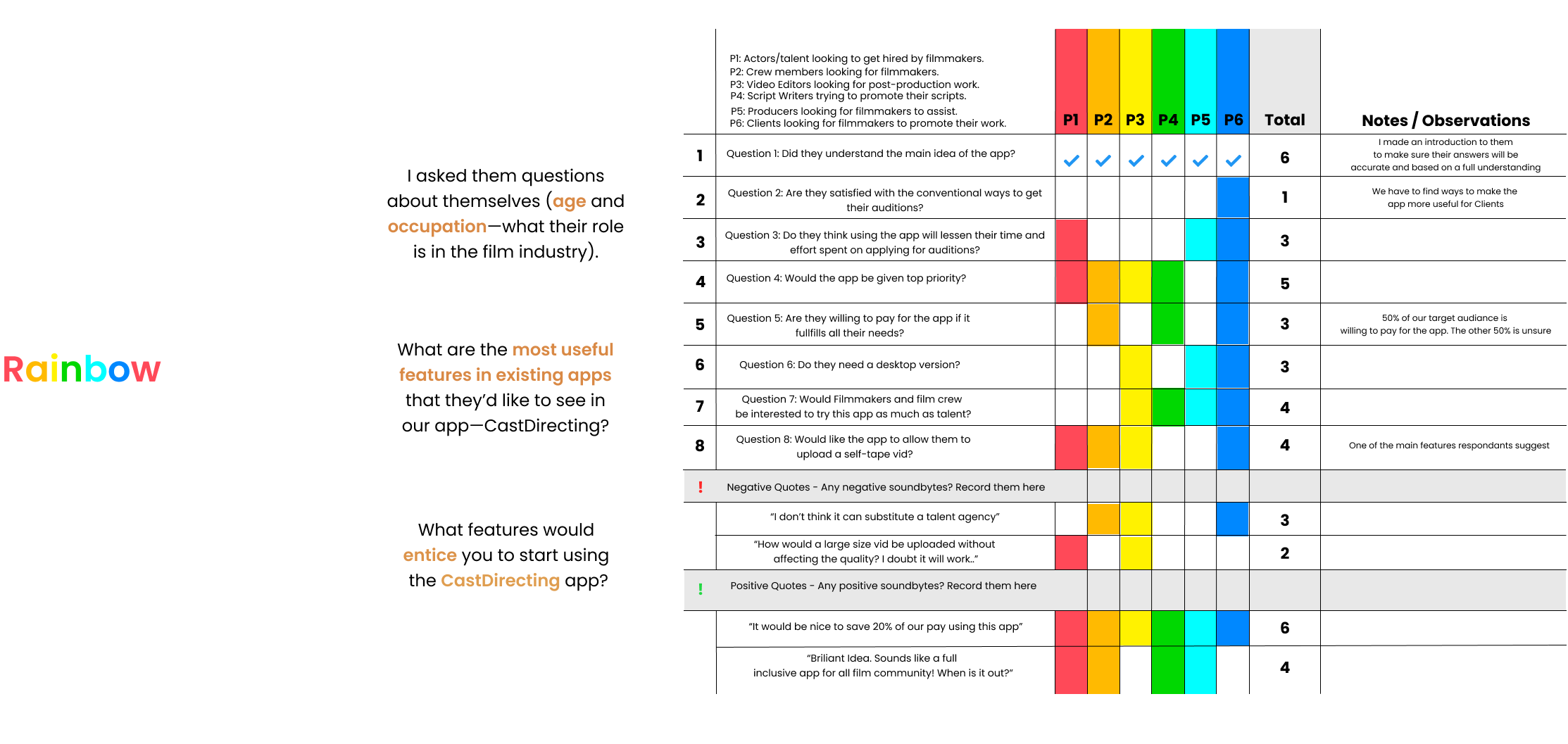
I decided to conduct semi-structured interviews with potential users hoping to reach the root of the problem. They're people from the Seattle film community.

Additionally, I wanted to gain insight into the average app user and their frustrations. Prior to conducting the interviews, I listed potential questions to be asked:
analysis image

Interview Summary

After interviewing six participants within my target audience, I was able to root out some features to add to my backlog, and opportunities that I can build hypothesis on.

I've noticed that actors and filmmakers are the most enthusiastic about the app. While clients, which form approx. 20% of my target audiance, are the least enthusiastic.
To overcome this problem, I needed first to know where we stand in the film market.

Research

To understand the film market and build an app that matches
business goals with the users' needs, I conducted an analysis based on
the competetors' strengths and weaknesses. I compared the number of downloads
to the number of reviews and ratings on the Google Play and Apple app stores.
analysis image

Card Sorting

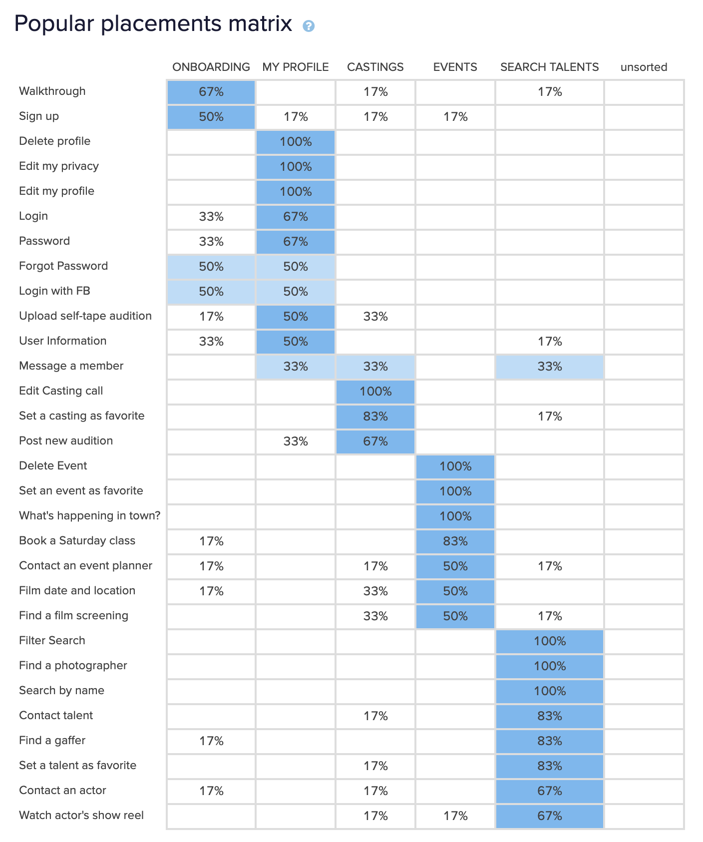
Due to Covid restrictions, I conducted an open card sorting on an online tool
Optimal workshop with 10 users. The goal of the sort was to determine new
category labels for navigation content, in response to recent test.

tableau img

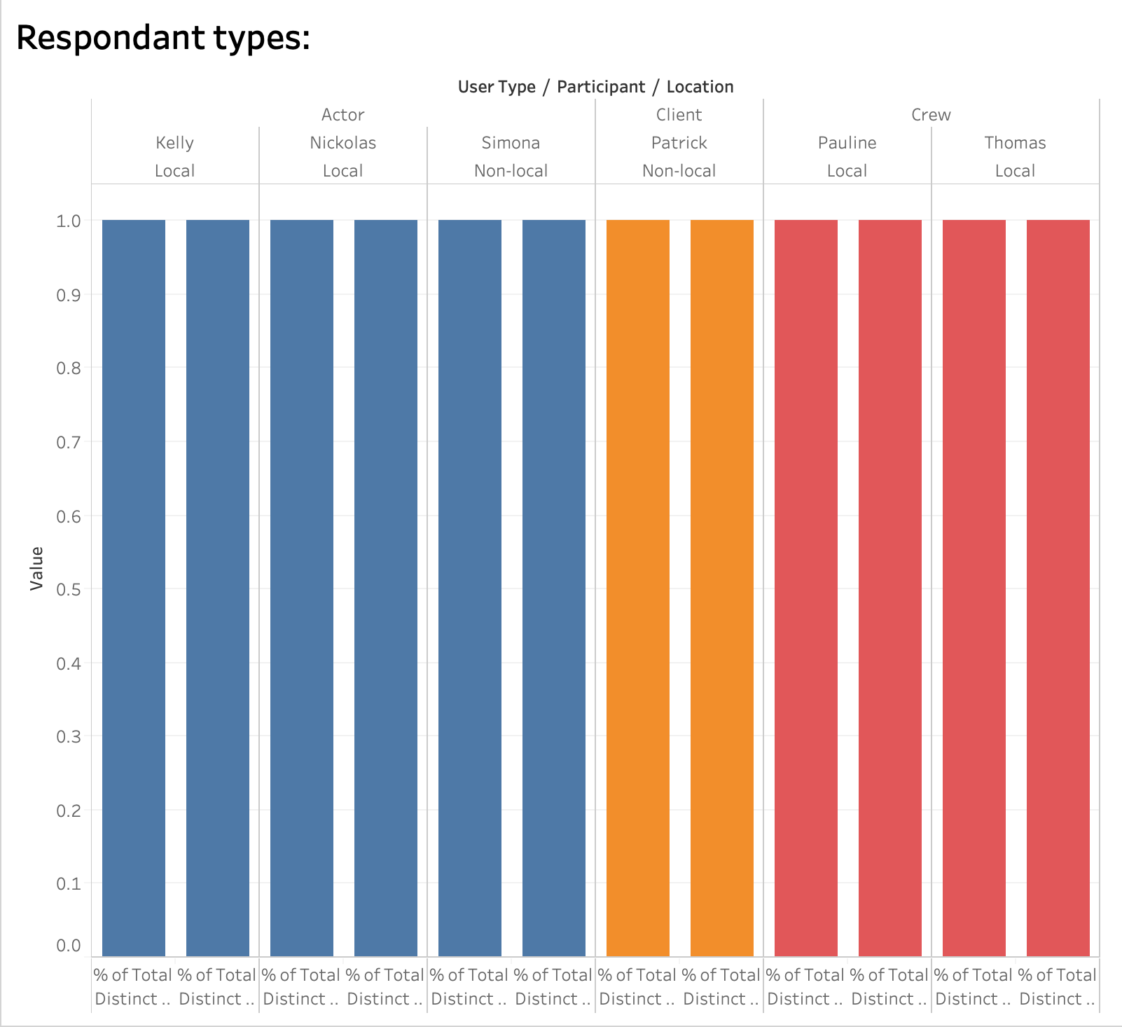
A diagram created in Tableau to show the name and type of each participant.

card sorting img

This table shows the percentage of participants who sorted each card into the corresponding category. It attempts to propose the most popular groups based on each individual card's highest placement score.

Insights

Catagories are a little vague and need to be named more discriptievely
to avoid confusion. A new version of the Catagory headers will be introduced
in the coming iterations.

Persona

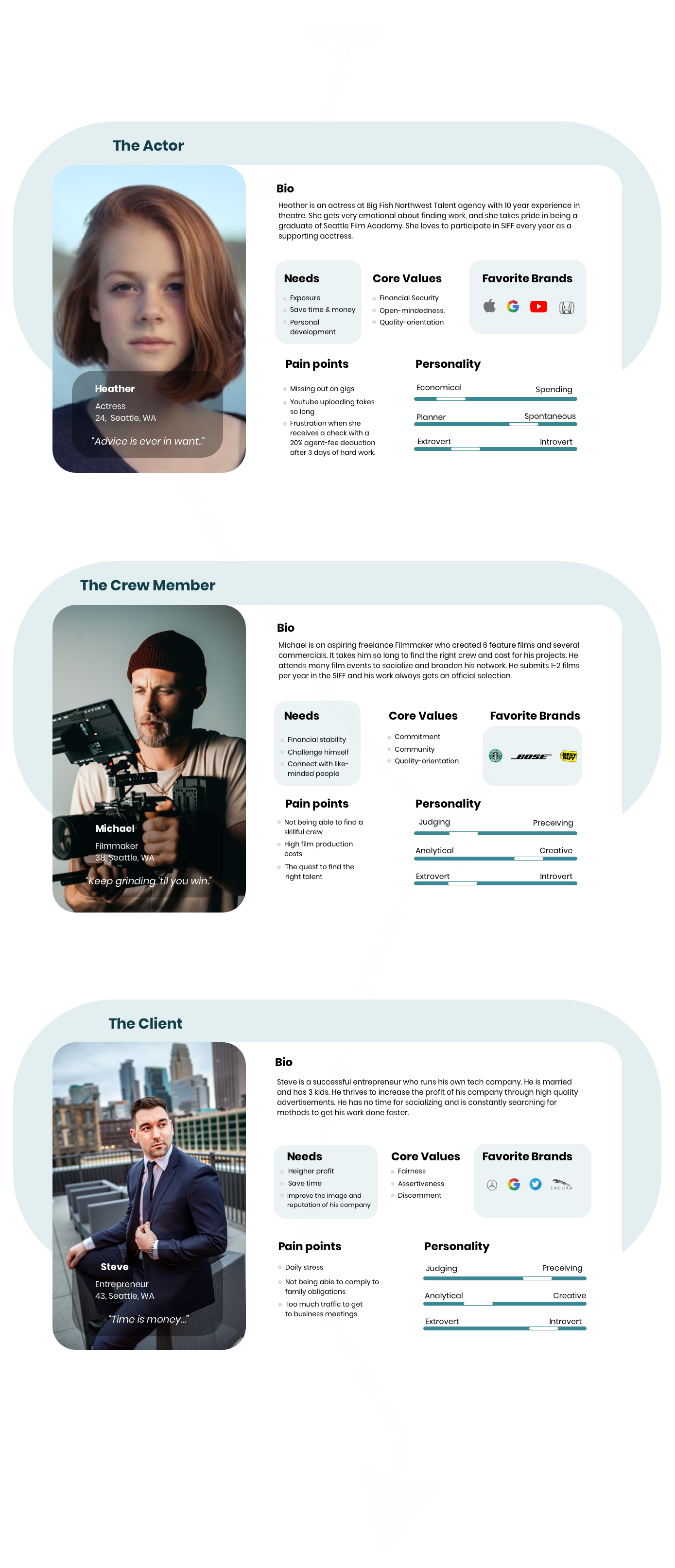
From the intital testing and interviews, I've devided my audiance into
3 defined types with 7 different characteristics to further understand
the types of users I'm designing for. I outline these types here in detail:

Persona

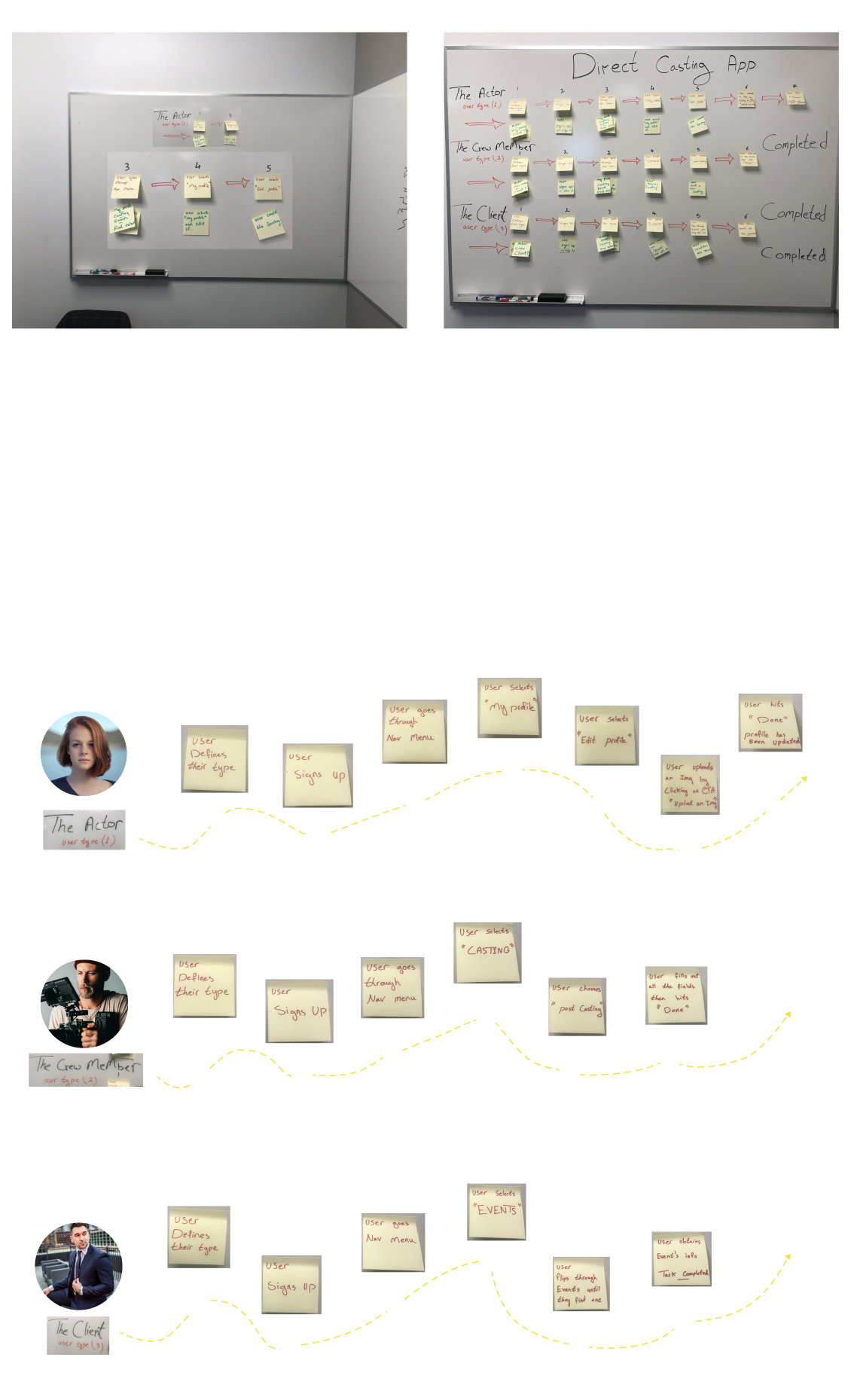
User Journey

user journey

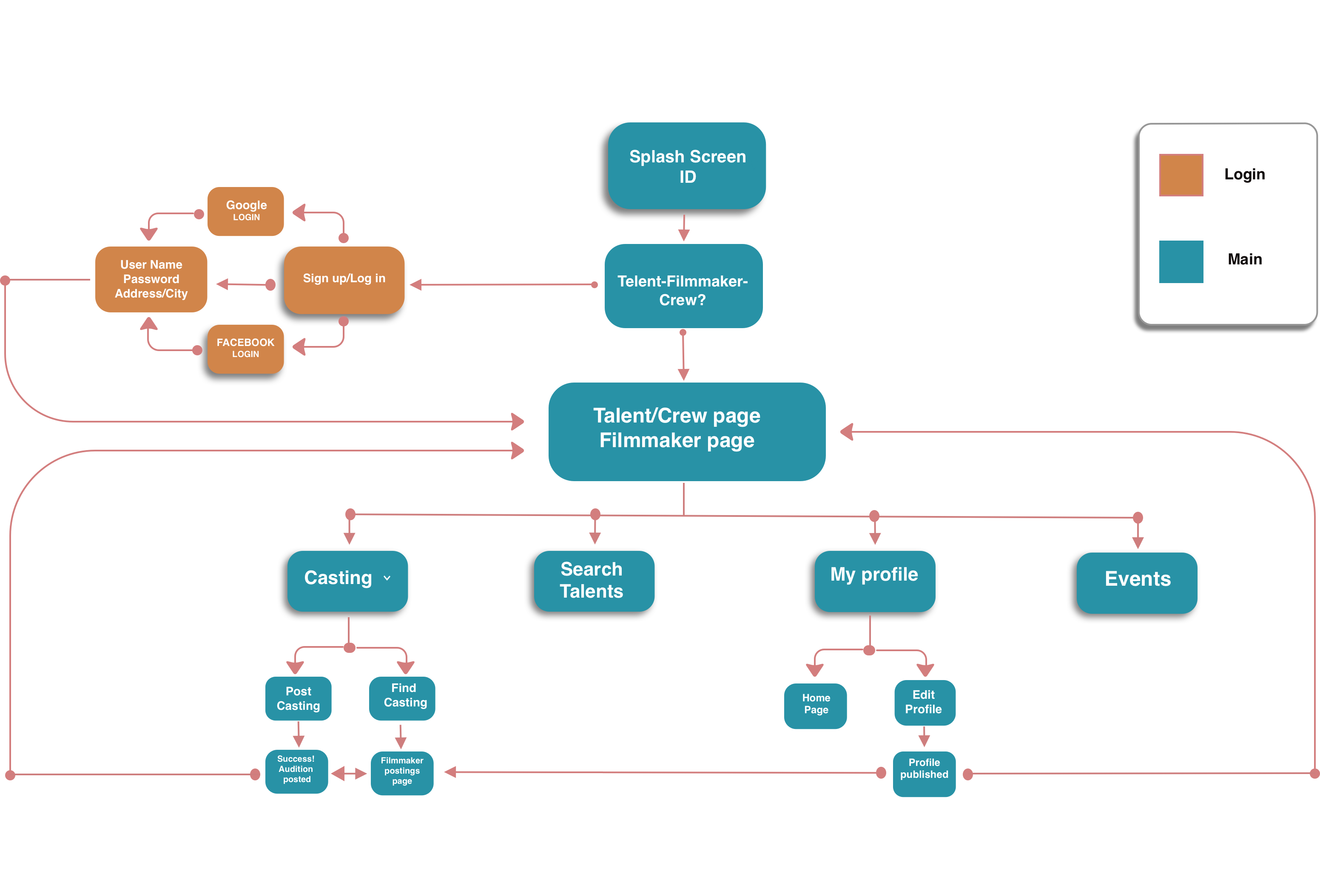
Sitemap

Applying previous research helped me in creating the architecture of the app.
I intended this sitemap to be flexibly expandable.
(as new ideas are generated in the coming iterations).

sitemap image

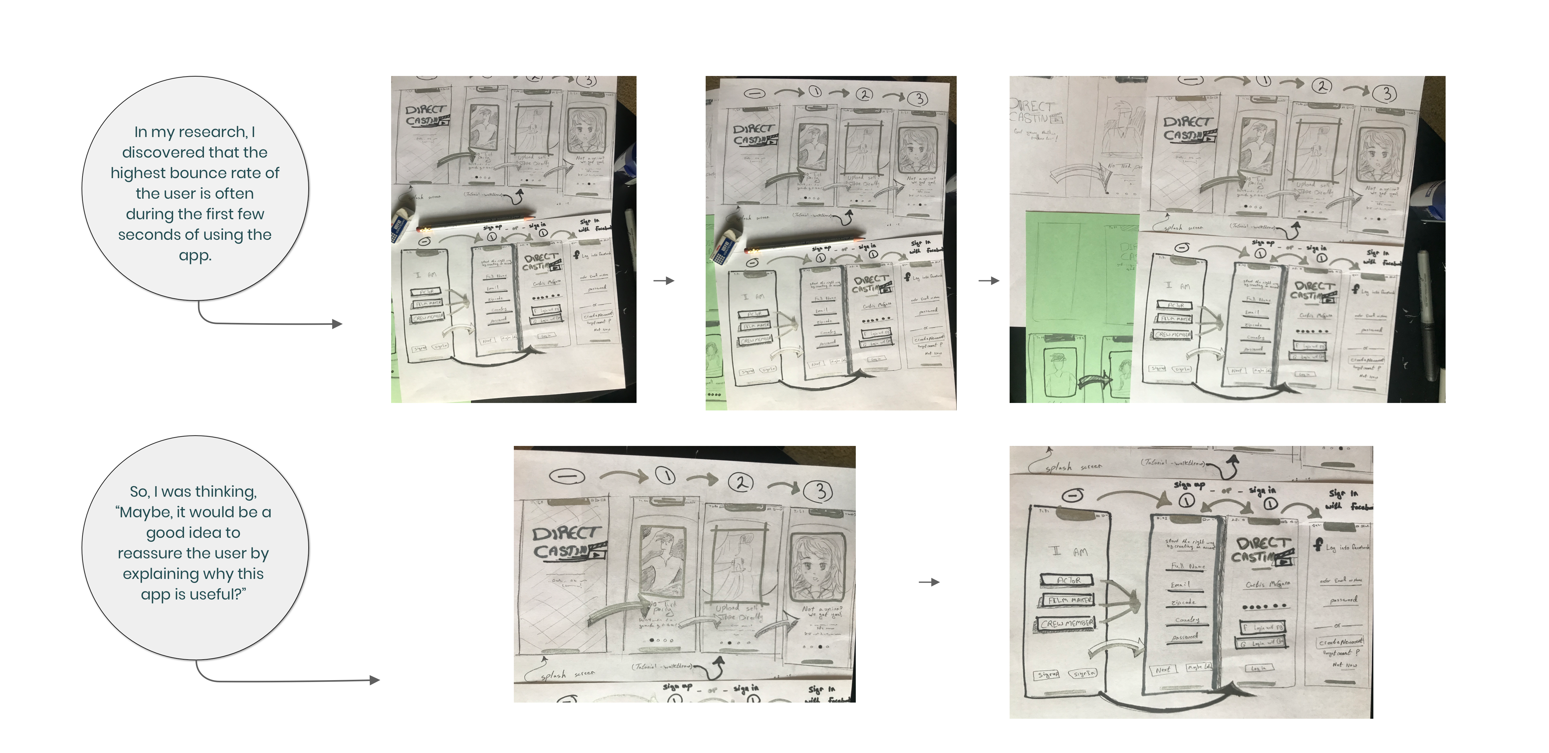
Low Fedility Wireframes

Some of my initial sketches to give
myself an idea of how visual mockup will be.
I used very basic tools: pencils, paper and a sharpie.

low fed wireframe

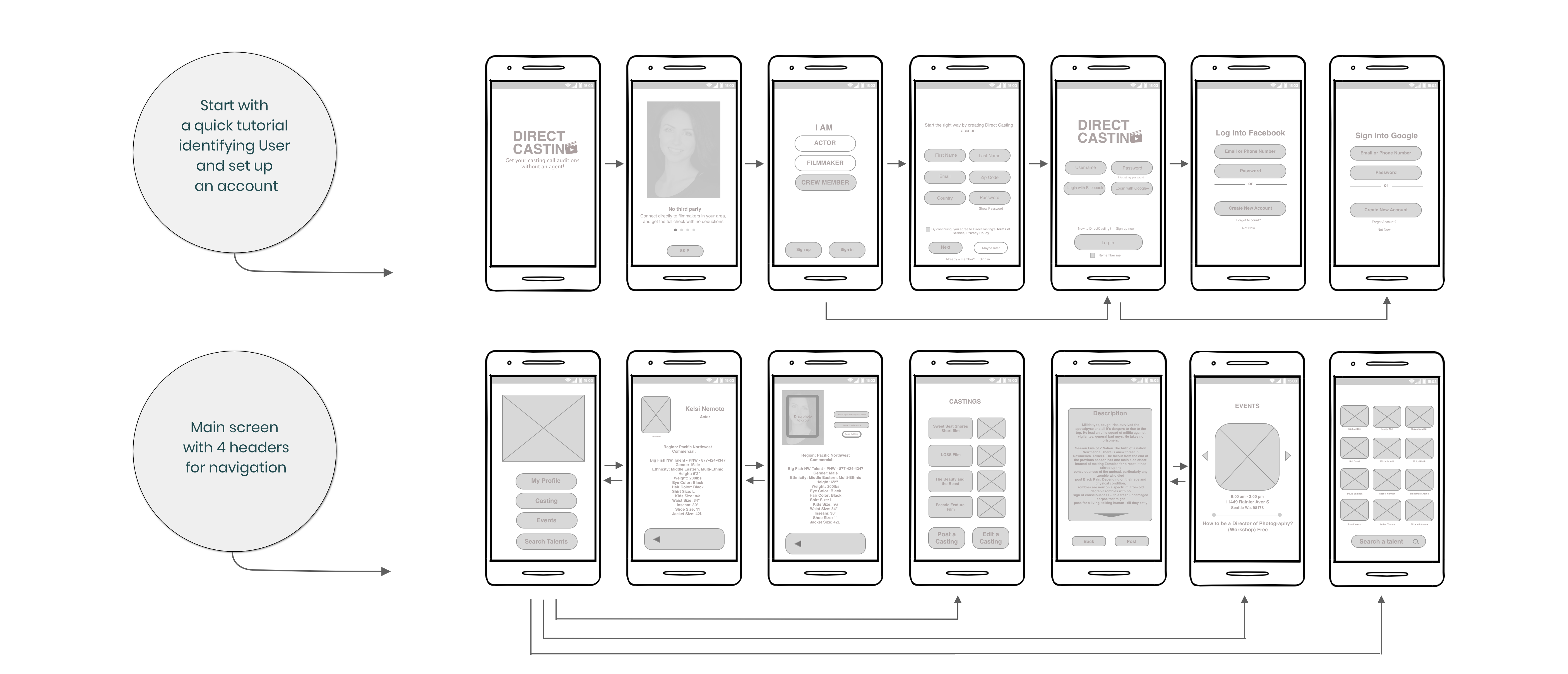
Mid-Fedility Wireframes

The challenge I face is minimizing the users' effort and reducing the steps
when I'm dealing with 3 types of users. I have to sort them out first before
I direct them to the right page.
At this point, I'm still focusing on usability and logic rather than aesthetics.

wireframe

Style Guide

Since studies show that 70% of UI depends on typography,
I chose Poppins font to add a friendly flair to the design.
It's clean, stylish and legible while simultaneously professional for mobile uses.

For color, I chose a degree of Teal as a primary color,
which blends the tranquil stability of blue with green's optimism.
Teal is the color of restfulness and mental and spiritual balance
which encourages a calm, reflective mood for the app's users
who are constantely stressed to find work.

 typography img

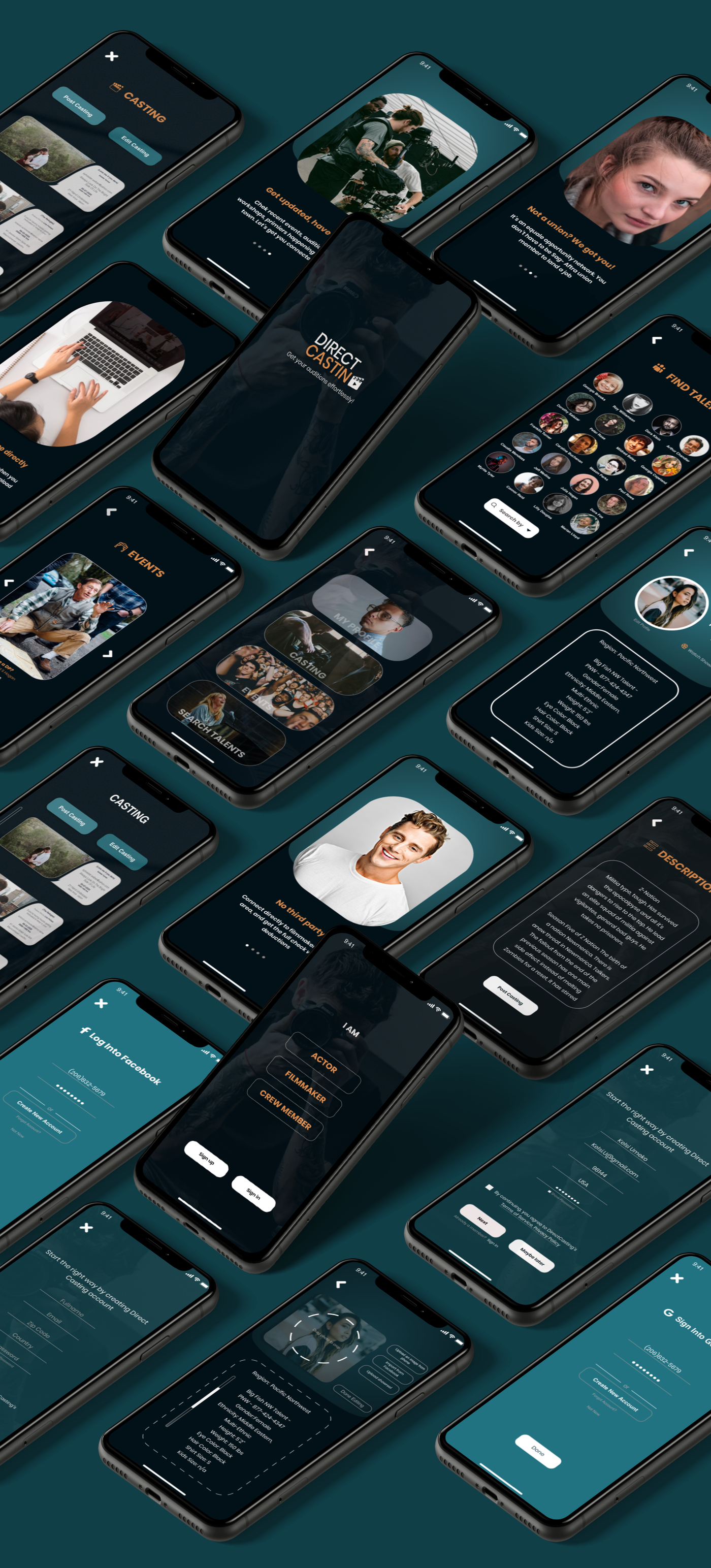
Visual Mockup

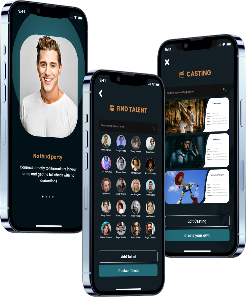
After deciding on the system design and choosing the color theory,
visual mockup was created for 20 screens. I'm still adding and
expanding the project according to user and tester feedback.

Isomatric Mockup img

Visual Interactions

To further help my colleagues on the development team,
I created these interactions on After Effect and Photoshop
to give them a better idea of the functionality. My chellenge
was to harness my imagination and provide realistic, applicable,
and easy-to-code design.

My first gif

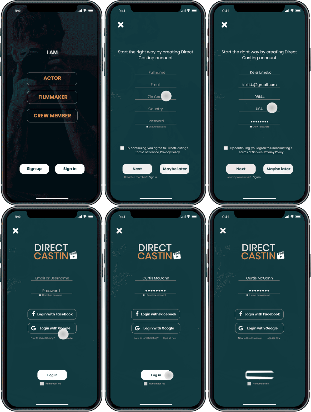
Log-in pages

Sign-in, sign-up, with Facebook or Google

My second gif

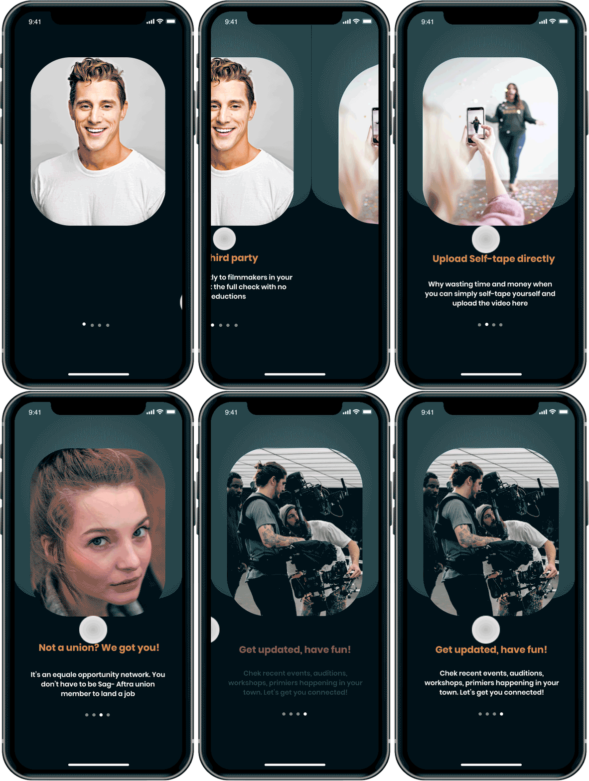
Onboarding

Guide the user through the app

My third gif

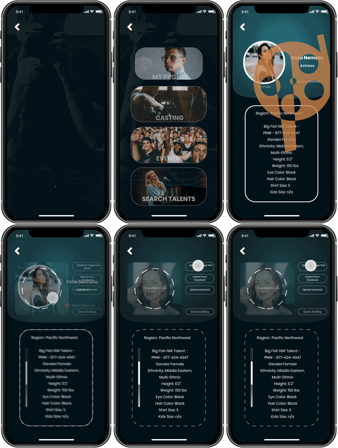
Main page and my Profile

Editing headshots, showreels, biography

What have I learned from this project?

• The early research stage is the most valuable stage in design. As a designer, we are often lured by attractive, trendy colors. We want to impress without remembering the "why."

• The primary goal is to understand the user, their problems, and then come up with a design that solves them. That intial process of research is essential for a project that is vast, it gives me a roadmap to navigate through what can be a foggy route.

Thank you very much for your time!

End pic

See also

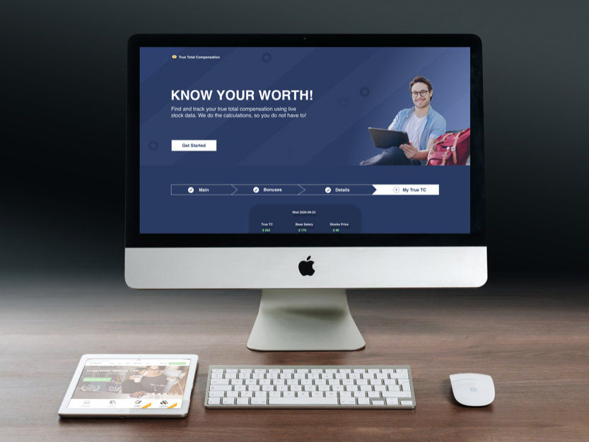
Emad's 3rd project showing a desktop screen
True TC (Web)
Emad's 2nd project showing a desktop screen
Teachstone (Web)